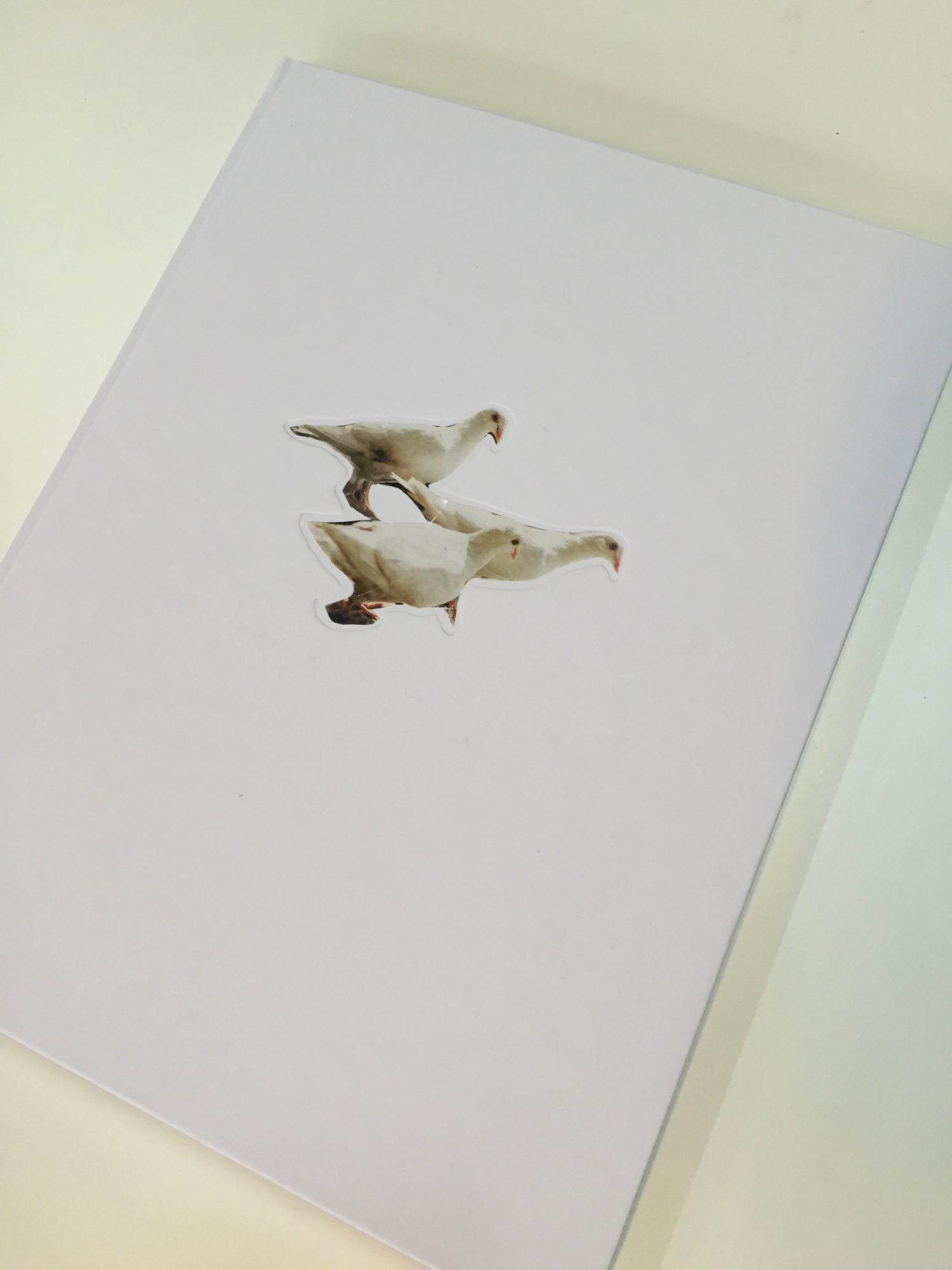
Wild Pigeons, a case in paper choices
 Carolyn Drakes book Wild Pigeons provides me a good case in chosing the right paper. Designer Syb, Carolyn and I spent quite some time on this issue.Together we cover the whole spectre of issues related to paper. Syb wants tactile paper, Carolyn also and wants a good reproduction quality of her images and I want them both to be happy. And then there is the need to be sensible with the money.
At Carolyn’s first book, Two Rivers we used white uncoated paper and the result was fine. For this book we looked at uncoated paper again, but also at bulky coated paper, to meet Carolyn’s desire to have a little more tonal range in the reproductions.
Somehow it didn’t completely convince us. It felt somewhat predictable, the usual compromise between designer and photographer. So we where in for a more outspoken choice that would meet all demands.
And then I remembered Giovanni del Brenna’s book Ibidem that I worked on recently. That was the first time I worked with a paper called X-per by paper mill Fedrigoni. It is a white uncoated paper with a special surface treatment allowing very sharp printing without losing the tactility of uncoated paper.
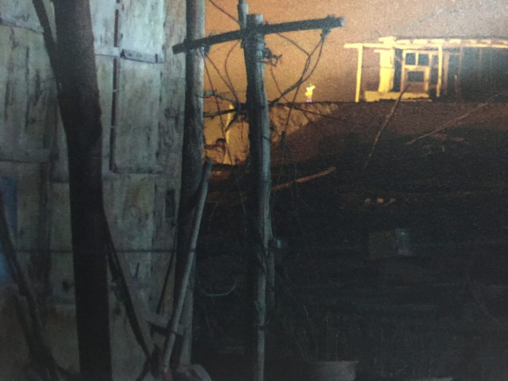
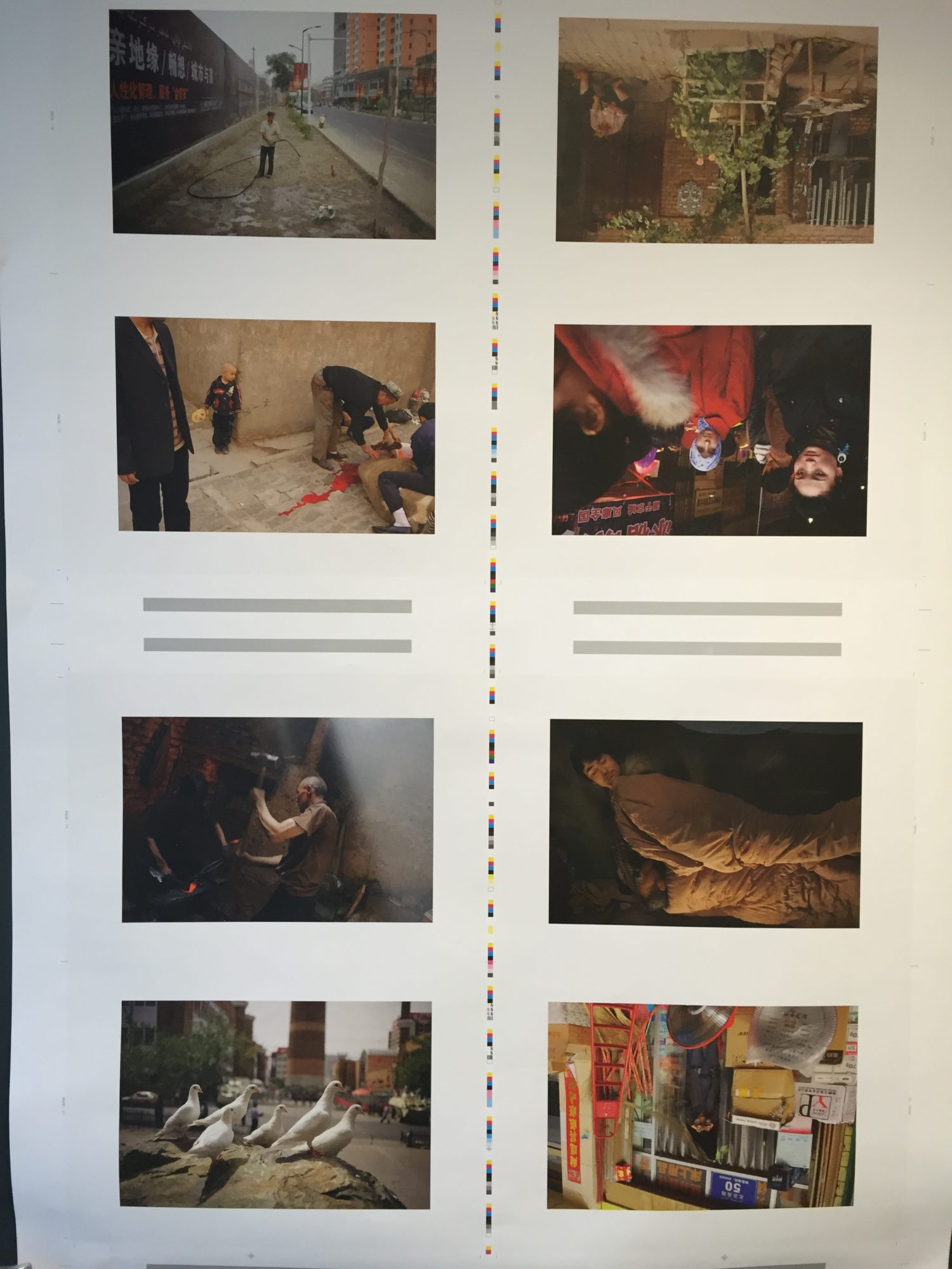
It took me and the printer a little while to figure out how to prepare and print images to get the desired result. Combined with printing in very high densities of ink we found the perfect match to all desires concerning paper and printing.


