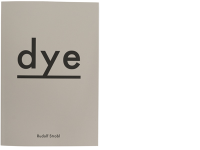
| Title | Dye |
| Artist | Rudolf Strobl |
| Designer | Rob van Hoesel |
| Colour grading | Colour & Books |
| Separations | Colour & Books |
| Press checks | Colour & Books |
| Production | FINE BOOKS, Jos Morree |
| Publisher | Fotohof Edition |
| Printer | Wilco Art Books |
| Binder | Patist |
| Pages | 42 |
| Paper | Amber Graphic 150 grs |
| Binding | Soft Cover Swiss Binding |
| Reproduction | cmyk neon +Pantone green |
| ISBN | 9-783902-993694 |
| Year | 2018 |
The Book
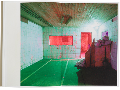
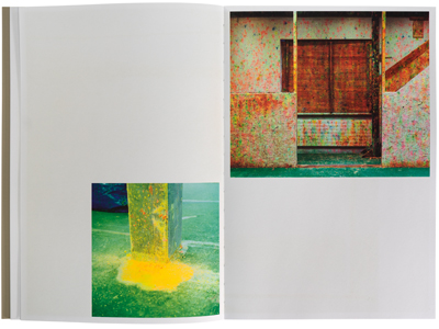
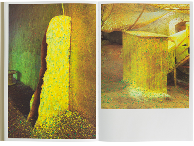
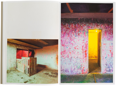
Dye takes you on a journey through our need as human beings to have fun and play pretend we are at war with each other. Often these places were we shoot at each other with paintballs are slightly weird. Especially when you see the aftermath of several shootouts. At the same time the images that are left are captivating and full of different colour and life.
The Process
These paint ball colours are often neon’s and therefor they presented a difficulty to get translated onto paper and maintain that bright neon colour. The first suggestion was to put some neon ink in the normal CMYK ink. However, as I thought, and the printer confirmed, that would not work. So, my idea was to add a separate green layer that would be added to the traditional four colour separations. This would keep the bright pink in check and balance the images our nicely. This was my first time trying to add a fifth colour to the printing process. I wrote about this process in more detail on my blog. This process was incredibly fun and challenging to do. I had been meaning to experiment with a fifth colour and this was my opportunity.
