| Title | Blue Period/Last summer |
| Artist | Nobuyoshi Araki |
| Designer | Geoff Han |
| Colour Grading | Colour & Books |
| Separations | Colour & Books |
| Press checks | Colour & Books |
| Production | FINE BOOKS, Jos Morree |
| Publisher | Session Press |
| Printer | Grafiplaza |
| Binder | Hexspoor |
| Pages | 216 |
| Papertype | phoenix motion xenon |
| Binding | ota pur |
| Case | Fopmawier Boekbinderij |
| Reproduction | cmyk |
| ISBN | 978-0-9966574-1-9 |
| Year | 2017 |
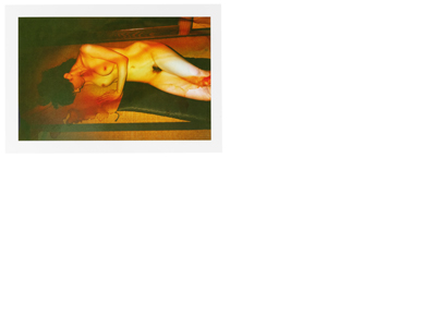
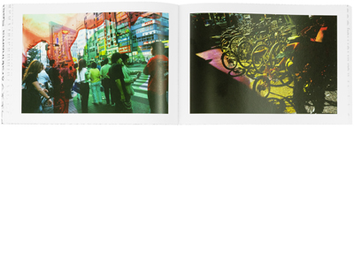
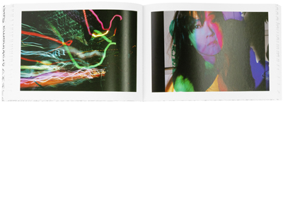
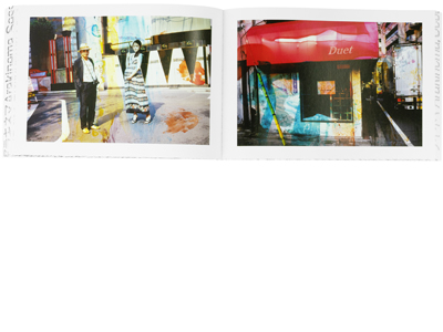
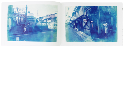
Blue period/Last Summer is two sets of films that were part of a larger collection called Arakinema. This was a performance series he made a couple of years ago. It is lesser knonwn about Araki that he has been experimenting with film since the '80. From these works Blue Period/Last Summer have been essential to this part of his art.
Blue Period represents the past whereas Last Summer represents the future. As a viewer this becomes clear through the subtraction of colour in Blue Period and the addition of colour in Last Summer. The removing of colour was done by a chemical solution creating these wonderful blue-ish coloured images.
Ultimately, for me, it was a unique chance to work on the reproduction of images of such a great master. Reproducing the vivid blues and purples in Blue Period created by this chemical solution and the intense colours in Last Summer was most definitely challenging. So in order to do this correctly I had to bend the limits of regular CMYK printing. This is what keeps my job interesting, finding new ways to accommodate artists in their art, colours and view. Printing two of such extremes forced me to think outisde the box and taught me new things about my job, and new techniques I can use.

