A book has sides too, an inventory of possibilities. Part I
A book is a three dimensional object. This means that designing a book is not only about the things that happen on pages. The sides of the book could be taken in consideration too.
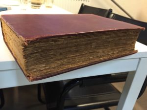
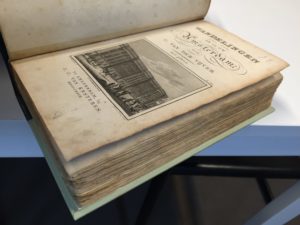
Back in the old days the sides of a book where extremely rough. Sections where folded by hand and trimmed before binding. Not all pages had the exact same size and folding was not always strictly parallel.
Take a look at the sides of some regular paperbacks on your bookshelves. It is not often that you pay attention to that particular part of a book, I guess. Nevertheless, without anybody giving it any thought there is already a lot to be seen:
The color of the paper for the pages obviously.
But also by touching it you feel whether it is a bulky (soft touch) or coated (a very solid touch) paper.
You can see on the front side whether the book is perfect bound or sewed in sections. With perfect bound you will see a clean cut and a solid book block whereas with sewing you can always recognize the sections structure.
A section with bleeding images you will recognize immediately on the sides.
And if the book consists of more then one type of paper, you will recognize these differences on the sides too.
Without the designer having given it any specific attention there is already a lot going on there.
In this blog I want to show you some examples of books from my shelves where the sides have been taken into account deliberately.
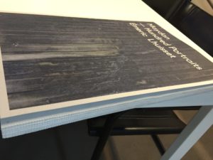
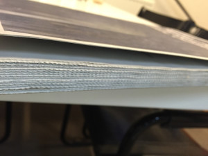
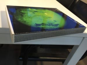
Maydan a hundred portraits from Émeric Lhuisset is printed on a newspaper press which also folds the sections in line. The edges of the sections show typical marks and roughness. After sewing and binding the pages have not been trimmed to preserve these typical marks.
The effect is quite close to the antique examples I showed above but now brings a connotation of news press.
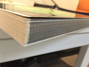
A variation on this theme is found in the book Why mister why by Geert van Kesteren. This book is printed in regular sheet fed offset. The images are part of a journalistic project. The photographer was embedded with the American Army in Irak and on assignment for Newsweek. The designers created a reference to newsprint by roughening the sides of the book in a milling machine after binding.
Here you can also see on the front side of the book that all images are bleeding except for two sections at the beginning and the end of the book.
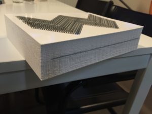
Designer Irma Boom has always been particularly keen to work on the sides of her books too. The book she made for Sheila Hicks is a very well known example. I’ll show here another book she did.
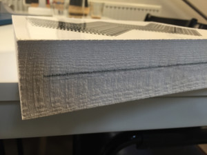
The book is called Water Weavers. Note the black stripe halfway the front where apparently something is printed bleeding from the pages. This must be a deliberate part of the design.
These are examples of what you can do in binding.
Another effect you can use is that whatever you print on the sides of a page will be visible on the sides of a book.
That subject will be discussed in part II, next week.
